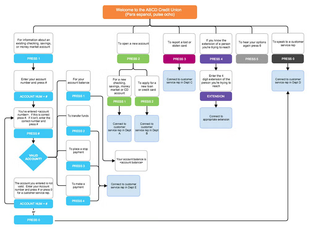
Creating a flowchart online with Gliffy is simple. Turning your creation into a professional-quality example of a flowchart isn’t much harder — you just need our top ten flowchart pro tips.
Follow along with these tips by starting your free trial of Gliffy's flowchart tool!

Size Matters
A flowchart is most useful when it fits on one page (or screen). If the process you’re plotting is very complex, consider taking a high level perspective to minimize the level of detail. If you need to pack in the detail, consider making a master flowchart that contains a number of subroutines and then break those subroutines down into more detail on auxiliary flowcharts.
Be Consistent
A flowchart will look more professional if you use consistently sized and spaced shapes. Once you’ve got all your steps laid out, take the time to even everything up and align objects precisely.
Built-in Gliffy tools like Snap to Grid and Drawing Guides make neatness near automatic. Our Popup Text tool helps keep copy from overfilling shapes by hiding it in mouseover windows.
Color Control
Unless you’re making a flowchart about the circus, you’ll be best off using a limited color palette. Pick one main color and then two to four others that compliment and contrast. For a quick start, Gliffy Diagram Themes provide you with a dozen simple options you can apply with a single click.
Get Hyper
One common flowchart blunder is to overload the diagram with too much information. Avoid this misstep by using hyperlinks to link to pages containing breakdowns of predefined processes, specs, or any other detail that would otherwise clutter your diagram.
To add a hyperlink, just select the desired text and click the Create Link icon in the Icon Bar.
Stand Out
When you want a process step to stand out, try using a larger text size. Bigger fonts draw the eye and add emphasis. Another option is to increase the thickness of the border on shapes for process steps that demand more attention.
Try Minimalism
Are you sure you need borders around all of your shapes? What about drop shadows and gradient fills? These design elements can help pep up a flowchart or they can be visual noise. Try taking everything away and then only adding back what’s needed. You may find simple looks more elegant.
Be Illustrative
While Gliffy packs an extensive library of flowchart shapes, sometimes you need something more. Consider adding your own images — company logos, icons, photographs — to boost the communicative power of your diagram.
To add images to your Gliffy account, click ‘More Shapes’ at the bottom of the Shape Library, expand the Basic and Flowchart section, and tick ‘Images’. Once the Images section appears in your Shape Library, you can drag-and-drop in your own images, tag them, and use them on your Canvas.
Feedback Loops
Before you send your flowchart out into the wild, let a trusted colleague or two take a look. Frequently a second set of eyes can help clarify where there’s room for improvement.
With Gliffy, anyone with internet access and a computer can be invited to collaborate with you on your flowchart. To add collaborators, just share the link to the diagram with your team.
Key Master
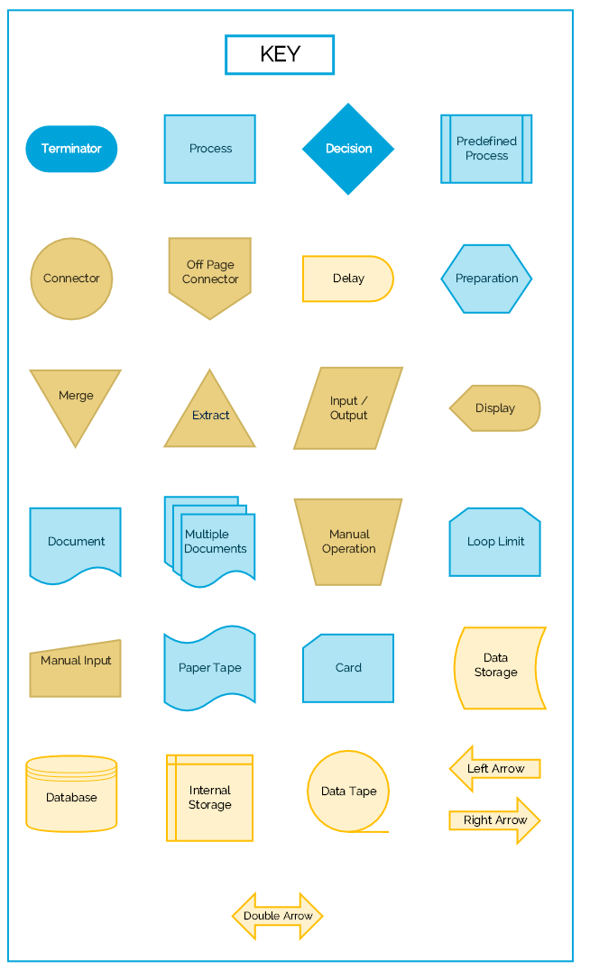
Some flowchart symbols are self-explanatory. Other shapes are less easy to decipher. Make sure that you’re communicating clearly by including a symbol key.
Start with our symbol key template below. Just grab the symbols you need and assemble a key that explains the symbols in your diagram.

Try Gliffy's Online Flowchart Tool
Once your flowchart is ready, you can publish, print, or export it for use with any number of other programs, including PowerPoint. Under File / Export / you’ll see options for saving your diagram as a PNG, JPG, SVG, or as a Gliffy file. For the highest quality image, we recommend choosing SVG.
Ready to create a flowchart of your own?